Volume Analytics
A practical guide to reading and operating the indicator on your chart.
Reading the Profile
01
Histogram
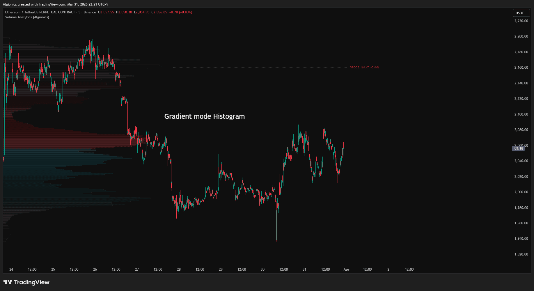
When you add Volume Analytics to your chart, a horizontal histogram builds from the left edge of your visible range. Each bar represents the volume traded at that price level. Longer bars mean more volume.
The profile recomputes every time you scroll or zoom, so the structure always matches what you see.
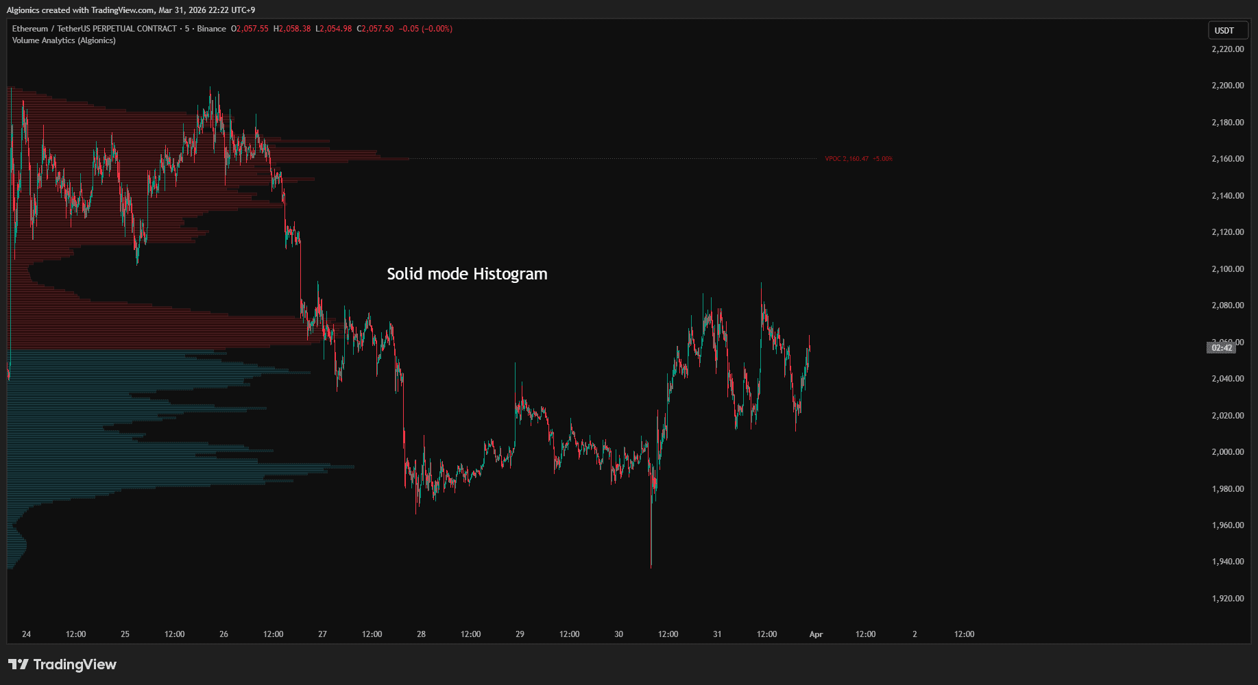
The histogram splits into two colors at the current price. Bars below are bull volume, bars above are bear volume. In gradient mode, bars fade as they move further from the current price. In solid mode, every bar is fully visible regardless of distance.
Nodes
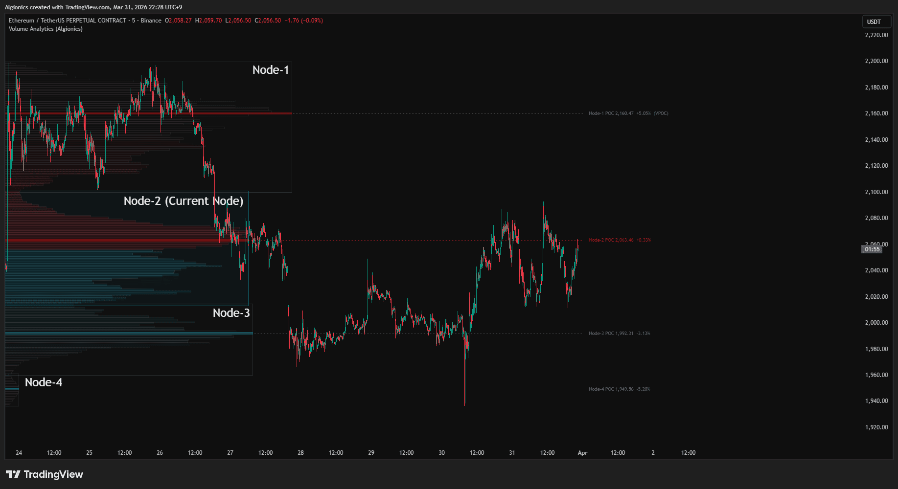
When nodes are enabled, the histogram is segmented into clusters. Each cluster is a node, a region where volume groups together, separated from neighboring clusters by valleys of low activity. The boundaries are computed algorithmically.
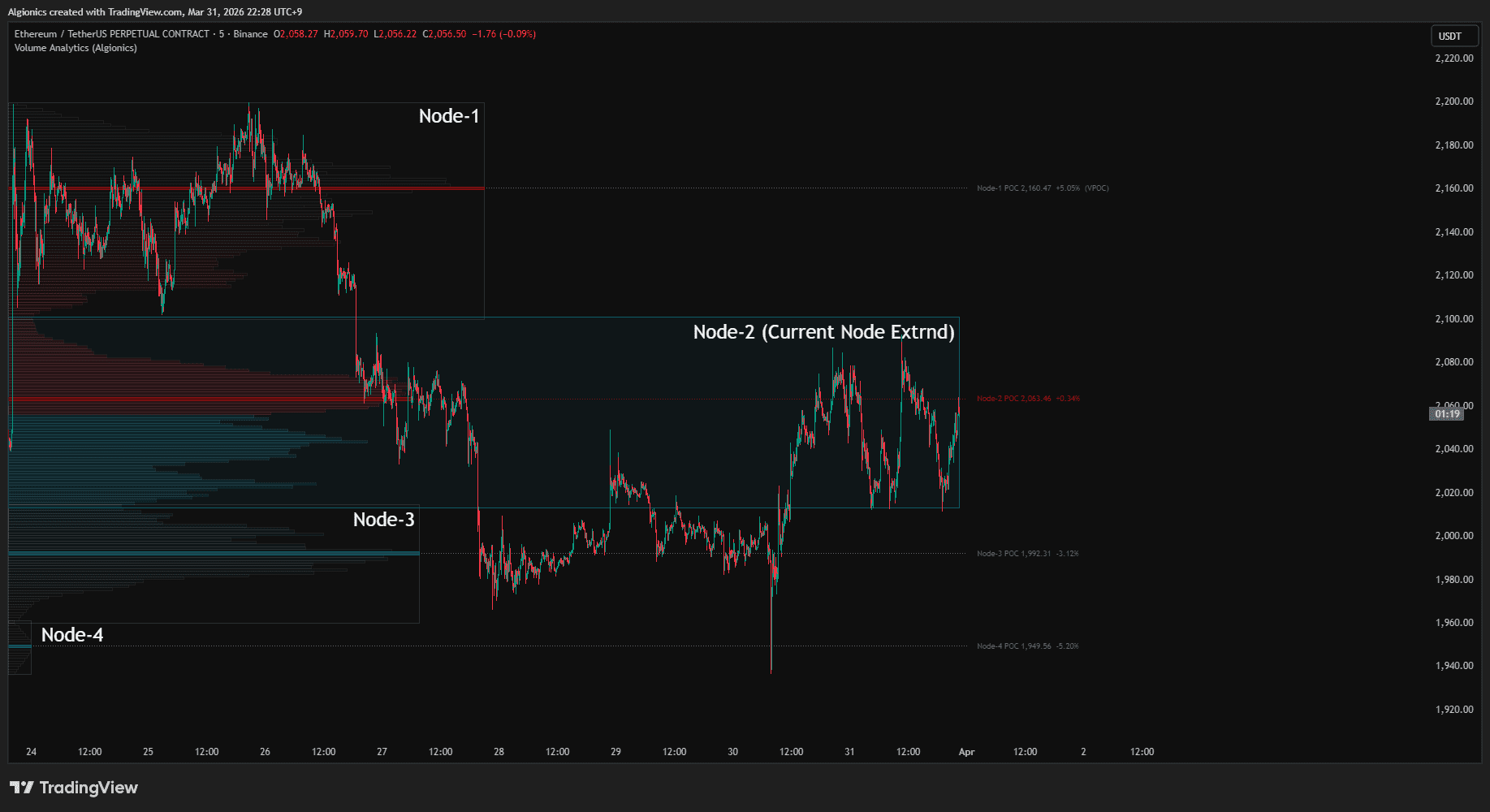
The node containing the current price is highlighted in color. All other nodes appear in neutral tones. If Extend Current Node is enabled, the active node's box and core stretch toward the right edge of the chart.
Core Zone
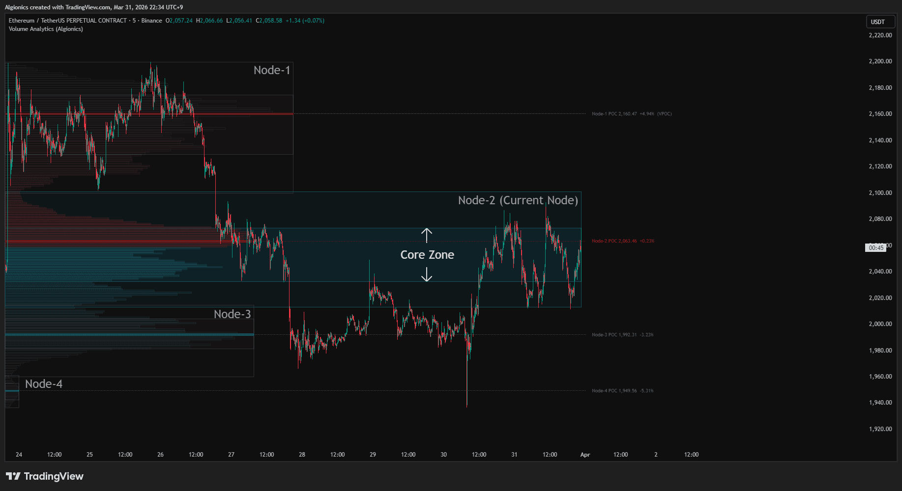
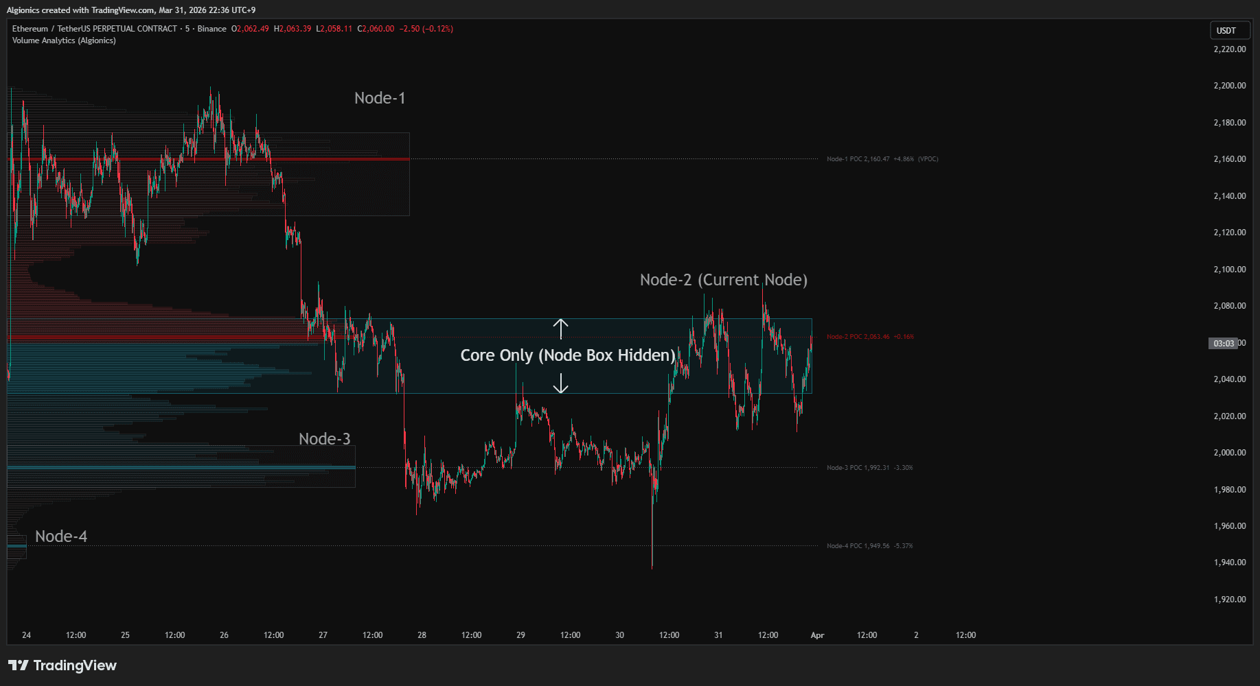
Inside each node, the core zone marks the statistically concentrated inner region where the majority of that node's volume sits. It is derived from the volume-weighted mean and standard deviation within the node, covering the ±1σ range.
POC
The POC is the highest-volume price level within each node, displayed as a highlighted bar with a dotted extension line and a label showing the exact price and its percentage distance from the current price. When a node's POC also happens to be the overall highest-volume level across the entire visible range, the label appends (VPOC).
Skew Bars
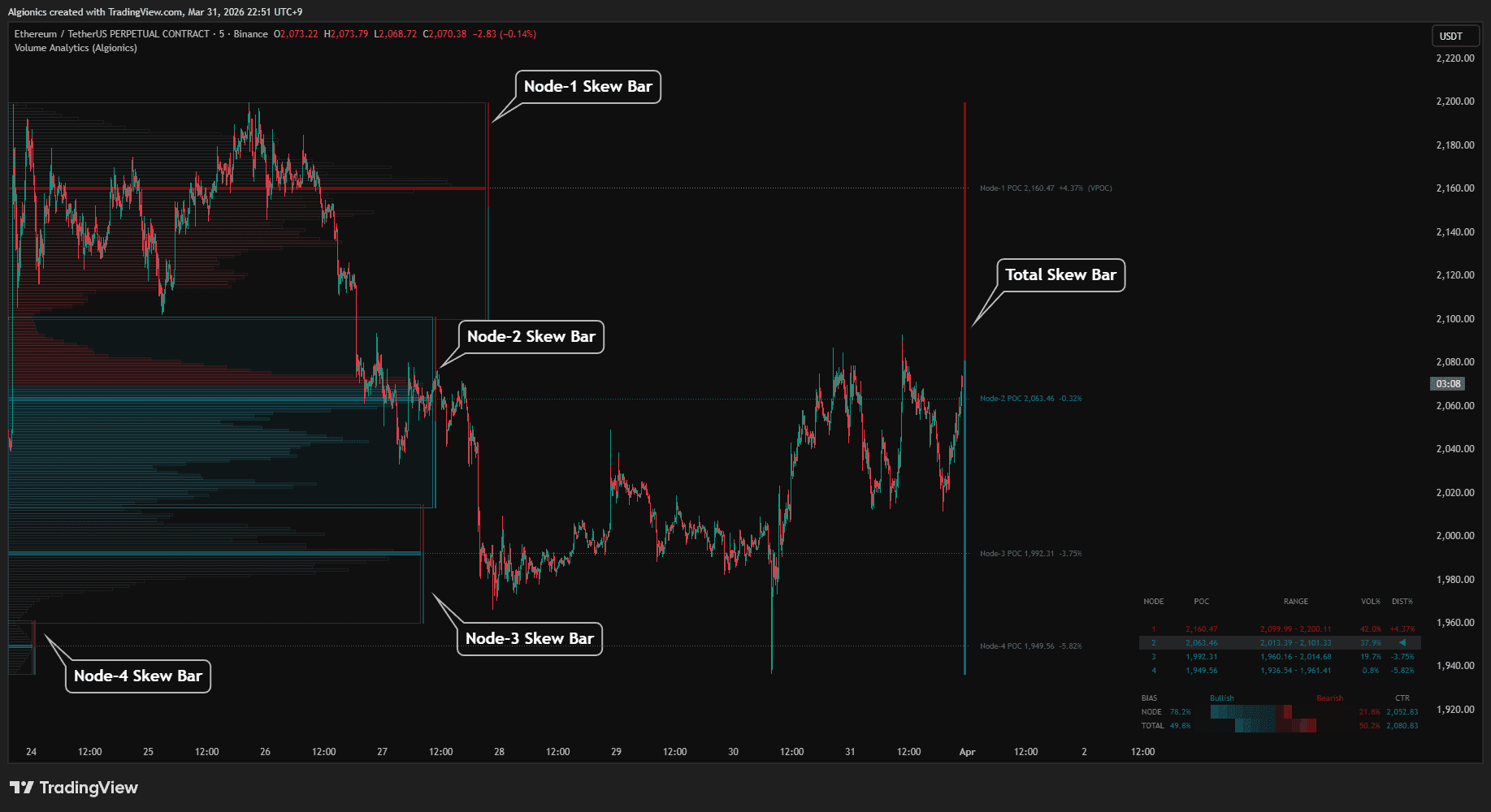
The POC is the highest-volume price level within each node, displayed as a highlighted bar with a dotted extension line and a label showing the exact price and its percentage distance from the current price. When a node's POC also happens to be the overall highest-volume level across the entire visible range, the label appends (VPOC).
A separate total skew bar does the same for the entire visible range. When the centroid sits below the POC, volume is concentrated in the lower half of the structure. When it sits above, the upper half carries more weight.
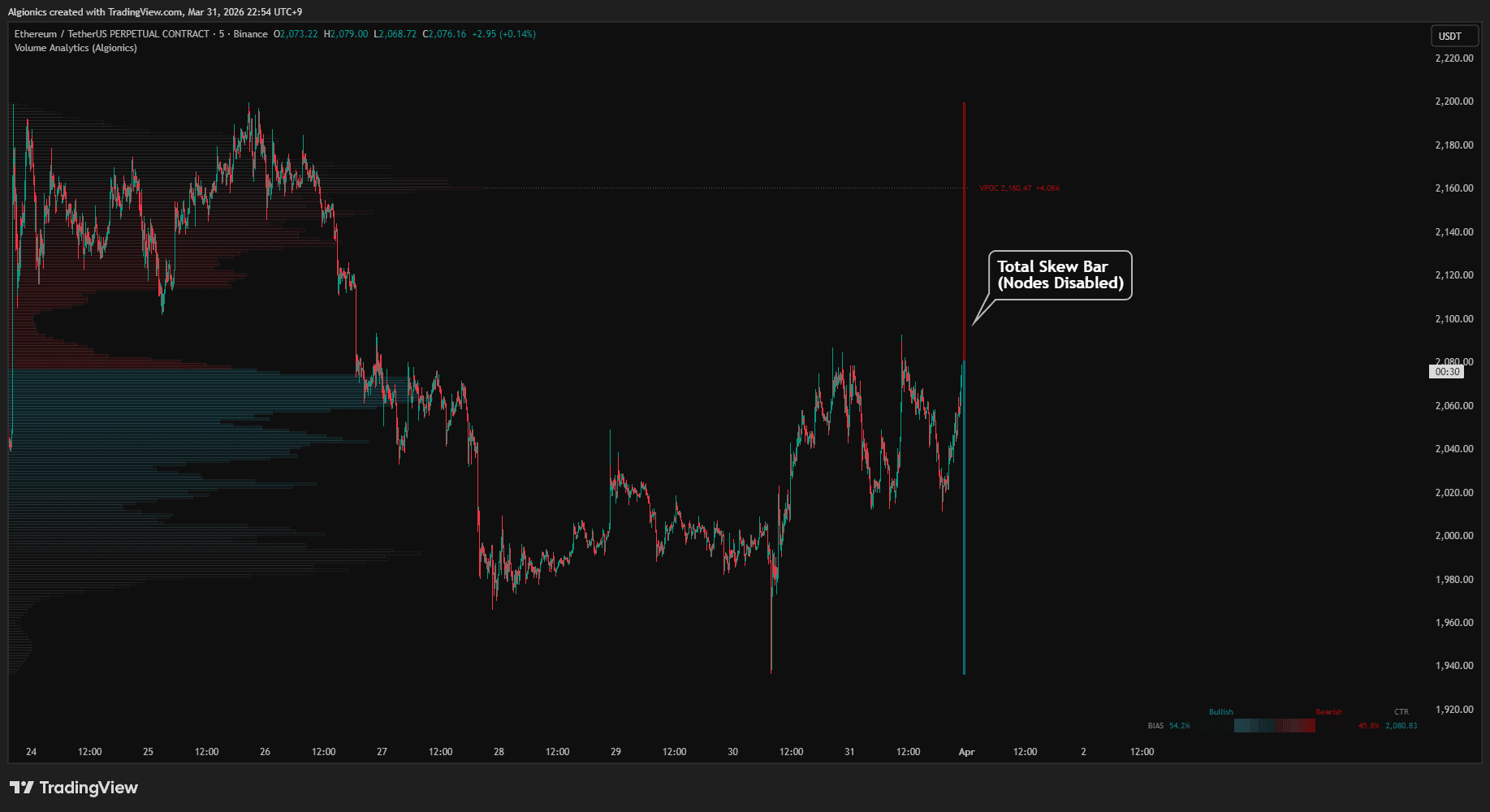
When nodes are disabled, only the overall VPOC is displayed with a single total skew bar beside it.
Segment Dashboard
02
Node Table
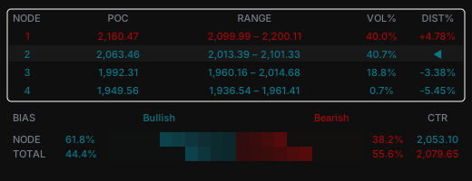
The upper section lists each detected node as a row. Nodes are numbered from top to bottom of the price range, with Node-1 being the highest.
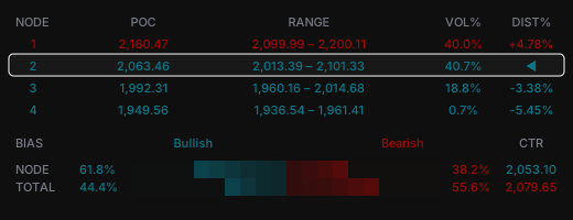
Each row shows the node's POC price, the full price range of that node, its share of the total visible volume as VOL%, and the percentage distance from the current price to that node's POC as DIST%. The row containing the current price displays ◀ instead of a distance value.
Text color indicates position relative to the current price. Nodes with a POC above the current price appear in bear color. Nodes with a POC below appear in bull color. The current node row is highlighted with a subtle background.
Bias Section
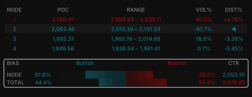
The lower section shows two rows: NODE for the current node and TOTAL for the entire visible range.
Each row splits volume into bullish and bearish percentages based on how much volume sits below versus above the current price.
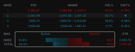
The percentages are visualized as segment bars that fill outward from the center. Bull segments extend left, bear segments extend right. Each active segment fades gradually from vivid at the outer edge to subtle near the center.
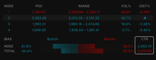
The CTR column displays the volume centroid, the volume-weighted center of mass. When the centroid sits above the node's POC, it appears in bear color, indicating that volume weight is skewed toward the upper half. When it sits below, it appears in bull color.
Technical Identity
03
Log-Space Profiling
Volume Analytics operates entirely in logarithmic price space. Every row in the histogram is spaced by equal ratios rather than equal dollar amounts, so the same percentage move receives the same visual weight whether the price is 10 or 10,000.
This eliminates distortion that linear-scale profiles introduce on assets with wide price ranges.
Gaussian Volume Distribution
Volume from each bar is distributed across price rows using a Gaussian kernel centered on the bar's typical price. Instead of splitting volume evenly across every row a bar touches, the algorithm weights it by proximity to the center. Rows near the middle of the bar receive more, rows at the edges receive less.
This produces a smoother, more realistic density curve than flat distribution methods.
Algorithmic Node Segmentation
Node boundaries are derived from the profile's own terrain. The algorithm smooths the volume distribution, detects local peaks, and locates the valleys between them. Each valley becomes a cut point that separates one node from the next.
No fixed count or manual input determines where nodes begin or end. The structure of the data decides.
Statistical Core and Centroid
Within each node, the core zone is computed from the volume-weighted mean and standard deviation. It spans the ±1σ range, the statistically concentrated region where the majority of that node's volume resides.
The centroid is the volume-weighted center of mass, used to measure distributional skew against the POC.
Zero Configuration
Every parameter in the system (smoothing radius, minimum node thickness, segment scaling) derives from the data. Nothing is hardcoded. The indicator adapts to whatever market, timeframe, and visible range you give it.
Object Pool Architecture
Drawing objects are pre-allocated into pools and recycled across render cycles. When the profile updates, existing boxes, lines, and labels are repositioned rather than destroyed and recreated.
This eliminates the garbage accumulation that causes most TradingView indicators to slow down over time, and keeps resource usage flat regardless of how long the chart has been open.
Visible Range Isolation
Data collection is bounded strictly to the visible chart window. Only bars between the left and right edges of your screen enter the calculation pipeline. There is no full-history traversal, no hidden lookback, and no wasted computation on bars you cannot see.
Single-Pass Rendering
All heavy computation (profile construction, node detection, core calculation, and visual layout) executes exactly once per render frame. Intermediate buffers are pre-allocated and zeroed in place rather than reallocated, removing memory pressure from the runtime path.
Settings
04
Volume Profile Settings
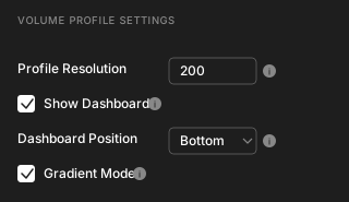
Profile Resolution controls how many price rows the histogram uses. Higher values produce finer detail. The default is 200. Lower values may help performance on older devices when zoomed out.
Show Dashboard toggles the summary table that displays node POC prices, ranges, volume percentages, and bias segments.
Dashboard Position sets the vertical placement of the dashboard on the chart: Top, Center, or Bottom.
Gradient Mode fades histogram bars based on their distance from the current price. When disabled, all bars use solid colors.
Node Settings
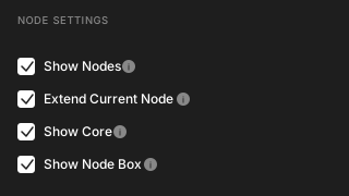
Show Nodes enables automatic detection and display of volume clusters. Disabling this removes all node-related elements and shows only the overall VPOC.
Extend Current Node stretches the active node's box and core zone to the right edge of the chart for easier visual reference.
Show Core displays the ±1σ core zone inside each node.
Show Node Box displays the full boundary box around each node. When disabled, only the POC lines and labels remain visible.
Skew Settings
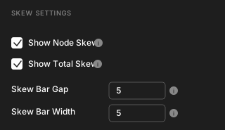
Show Node Skew displays a vertical skew bar beside each node, showing the volume centroid position.
Show Total Skew displays a skew bar for the entire visible range.
Skew Bar Gap sets the spacing between the node edge and the skew bar.
Skew Bar Width sets the thickness of the skew bars.
Color Settings
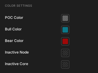
POC Color sets the color of the overall VPOC histogram bar and its extension line.
Bull Color sets the color used for bullish volume bars, active node elements below the current price, and the lower portion of skew bars.
Bear Color sets the color used for bearish volume bars, active node elements above the current price, and the upper portion of skew bars.
Inactive Node sets the background color for nodes that do not contain the current price.
Inactive Core sets the background color for core zones within inactive nodes.
Tips
05
Zoom Controls the Structure
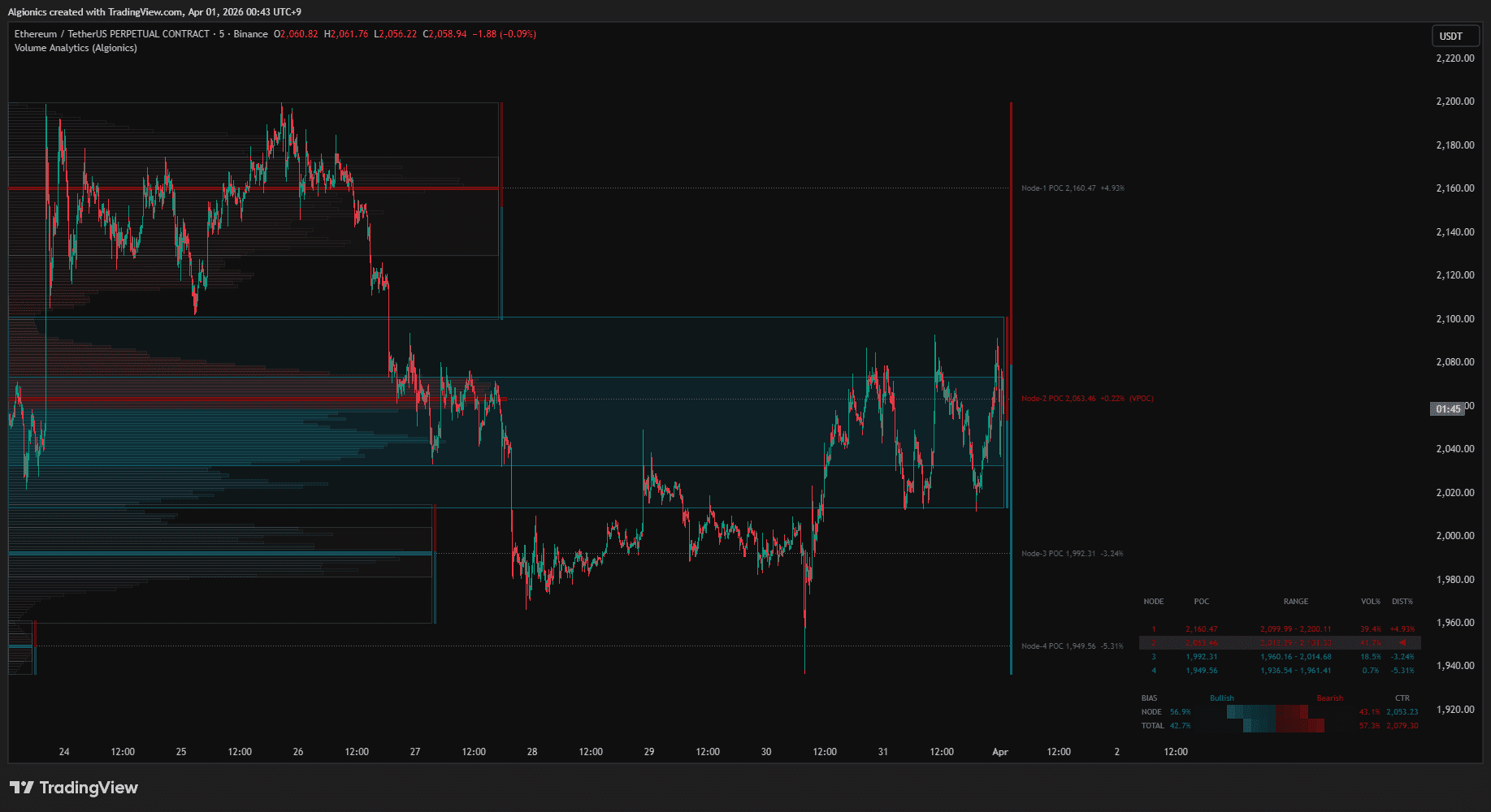
Volume Analytics rebuilds the profile from your visible range every time you scroll or zoom. Zooming in isolates recent structure with more granular nodes. Zooming out reveals the macro landscape with broader clusters. Use this deliberately. Narrow the view to find local levels, widen it to see where the big volume sits.
Timeframe Stacking
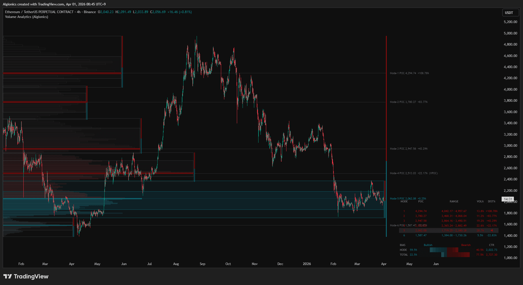
Lower timeframes produce more bars in the visible range, which means more data points feeding the profile. A 5-minute chart zoomed to one week will generate a denser, more detailed profile than a daily chart covering the same period. Use lower timeframes when you need precision, higher timeframes when you need clarity.
Node Count as a Volatility Signal
The number of detected nodes tells you something about the market. Many small nodes suggest fragmented, choppy structure. Few large nodes suggest consolidated, directional structure. You do not need to count them. The dashboard shows it at a glance.
Reading CTR Against POC
When the centroid and POC are close together, volume is evenly distributed within the node. When they diverge, the distribution is lopsided. Volume is concentrated on one side while the POC sits on the other. The skew bar on the chart and the CTR column in the dashboard both visualize this relationship.